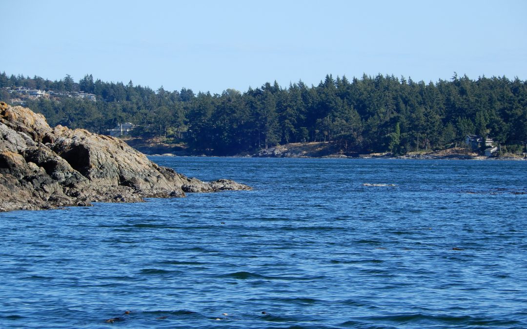
Well, we’re into the dog days of summer. Hope everyone is doing well. A couple of weeks back Kevin and I decided to take advantage of the beautiful weather and it’s a good thing we did that day as it rained and was cloudy, windy and cool for the next few days.
One of the benefits of living on an Island is there are lots of little neighbourhood beaches and parks around to visit if you know where to look. So after work one day we decided to go exploring and visited a quiet cove where we spent time sitting and just contemplating how lucky we are to live in such a beautiful area.

Adding Value to your Quilts
Last blog post I wrote about adding that WOW factor to your quilts by adding that bit of deep dark. You can read more about that here.
I thought I would continue that theme on this post as well.
Value
Value is defined as the relative lightness or darkness of a color.
I was searching through the Robert Kaufman website and found a pattern I really liked called Sea Stars that was designed by Elise Lea and will be available as a free download in September 2020 from https://www.robertkaufman.com/quilting/quilts_patterns/sea_stars_4004/
Even though the quilt was designed using Kona solids the stars still seemed to twinkle and it was because of the designer’s great use of value in the pattern.

I thought that this would be a great illustration of what I was trying to convey so I recreated the pattern in EQ8 (a software program used to design quilts) so that I could show the original quilt and then some different variations. The quilt was designed using several different blue fabrics with even a very soft blue as the background fabric. Yet even though it was made with all solid fabrics and all in blue because of the rich use of different values in the design the stars seem to sparkle.
Here is an example of the same pattern with a variety of different blues however the deep dark is missing. It is still a really pretty quilt however the stars don’t sparkle in quite the same way as the quilt above.


Here are two examples of two-colour monochromatic quilts the one on the left is made with a deep dark with a light blue background, the one on the right is a medium blue with the same light blue background. They both work however, the one on the left that uses the stronger contrast stands out much better than the one on the right.
More Value!
I have two more examples of how adding a deep dark colour to a quilt does bring the quilt to life. This is my own design which I did in EQ8 so there isn’t a pattern for this. At least not yet.


Both of the above quilts work nicely. They both have enough contrast in the value to make the design stand out and not all mush together.
The quilt on the left has the deep dark to make it really stand out and could work nicely for a quilt made for a man.
The quilt on the right doesn’t have that deep dark, however, it does have the contrast of light, med light, med and med dark fabrics in it to still make it work. Without the deep dark the quilt is much softer and would work nice in a girls room.
I hope this gives you a little more confidence to playing around with value in your own quilts and remembering to add just a little deep dark to really make your quilts stand out.
Happy Quilting