I have been thinking a lot about different styles of quilts these days and even what “style” I may fit into. What got me started on thinking about this is the quilt that I am currently working on which I can’t show as of yet. The quilt I am working on is so very different than the Light Within quilt I just finished and yet I love both quilt designs equally.
The truth is that I don’t have any one style that I like better than any other. I will say that if the quilt design is more traditional I would rather have it scrappy than just made of two or three fabrics and not all one designers fabric either. If a quilt calls for 2 metres of a light background fabric, say white or cream, and I only have 4 half metre cuts in my stash then I will use what I have and make the background scrappy. As long as the value is the same, and the whites or creams are similar then it will look great. I also don’t like ‘mushy’ quilts. What do I mean by that? I mean quilts that are made with fabrics all of the same medium value! I know some people like that but personally I just find them boring and completely lifeless. See an example of what I mean below

In my opinion (and this is just my opinion) the pictured quilt is lifeless, the colours are similar, the value (the light or dark of the colour) are the same and even the print is all small. Yes some fabrics are slightly darker than others but still this is basically boring.

Look how much more exciting this simple quilt is on the left. You have navy as your deep dark, you have contrast in colour, value and size of print. It turns this simple quilt into something that is fun and exciting.
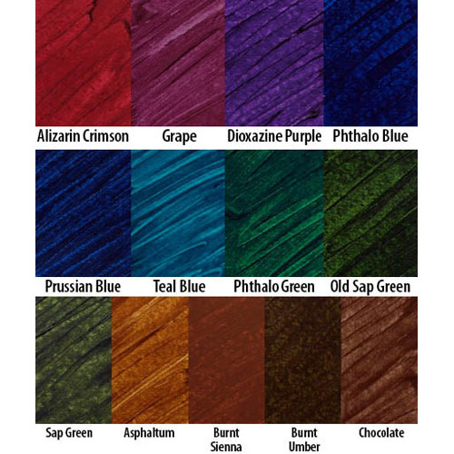
My mother is an artist and the one thing she taught me is that you always have to have a deep dark in your design somewhere. Well I think that holds true for very traditional quilts but maybe not so much for more modern designs which are more about design and colour contrast. Deep dark colours don’t have to be black take a look at these wonderful rich colours below.

All of these colours could be used as a deep dark in a traditional quilt design. Aren’t they wonderful. Look how rich they are. I love the movement these fabrics have as well, notice the lines running through the fabrics and the slightly lighter value change in the Teal Blue.
Now you pair these fabrics up with other fabrics in either the same colour but different value (lighter) or maybe the Crimson with some lighter green fabrics and throw in some different scale prints and you will have a great start to an exiting quilt design.
Which brings me back to what type or style of quilt design I like. I really like scrap quilts, I love the variety and the way the fabric colour and value makes the design really work. I love the quilting being done in the negative space on more modern quilts, I love spiky star designs for that matter I love star quilts period. I love landscape quilts and well I guess there is not much in quilting I don’t like except the mushy lifeless quilts.
What kinds of quilt designs do you like?
Yesterday is history. Tomorrow is a mystery. Today is a gift.
Click here to receive the free Inspiration Journal pattern sign up for the newsletter

