
Have you ever been to a quilt show and looked at a quilt and thought there was something missing?
Or maybe you have wondered why a quilt you’ve made looks lifeless, boring even. You made it with your favourite fabrics and they are all beautiful but still….
Or maybe you saw a whole group quilts all made by different people BUT the same pattern. Some of these were beautiful and you loved them and some were….. well, less than inspiring however you couldn’t figure out why. I mean after all they were the same pattern!
Now you may have put this down to colour, however, the real WOW factor comes through VALUE!
Value being the relative lightness or darkness of a colour.
All colours come in a range of values.
The colour blue can range from light baby blue to a medium blue all the way to a dark midnight blue.


The Power of Value
When I first started quilting, I took a beginner’s class and we were told to pick a print and then choose about 6 fabrics that would co-ordinate with the print. Not knowing anything about colour value I choose my 6 fabrics and a neutral background fabric.
When I started making my first blocks, they looked so insipid, I mean really bland, I was really disappointed with them and I couldn’t figure out what was wrong. I knew something was missing but had no art experience so didn’t understand why I really wasn’t happy. My Mom, who is an artist, looked at my work and said right away, you don’t have a deep dark.
My reaction was, huh, a what?!
A deep dark she repeated! Ok please, explain.
Value, she said, you have the light background and your print, and all of these medium fabrics but no dark contrast, you need the deep dark to add life. You don’t need much but it is missing.
Here is the aforementioned first block I ever made. It looks fine as it is however as I mentioned, it just looked like something was missing for me and I couldn’t figure out what that was. If all of your fabrics are on the light side or of medium value there will be no contrast and therefore your quilt could look really well, washed out, insipid even. This is what I was finding with this block. There was contrast as the background fabric was light, you have a med light with the yellow and a darker fabric with the red but no WOW factor going on here.
Now maybe you like that look, but generally, it really doesn’t make for good quilt design overall.
You don’t need a lot of that deep dark, a little can go a long way, however, you do need that contrast and your eye (like mine did) will notice it’s missing even if you don’t understand what you are seeing.


Ok so this is my first ever quilt. I am not sure how WOW it is as it is a sampler quilt however, I think you can see what a good example this is. Imagine if all the blocks in this quilt were made without that deep forest green or that deep red. If they were all simply made using the medium fabrics like in the first block above. The quilt would have been really bland. It would have been fine, I mean it’s a quilt, made with love but adding a small bit of deep dark into each of the blocks makes the blocks pop off the quilt instead of mushing together into the background.
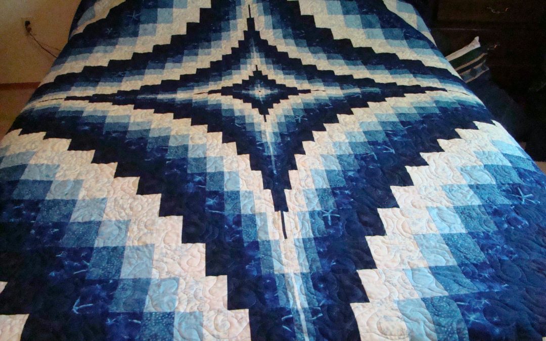
Some other examples of using that deep dark to create sparkle are the blue bargello and Vintage Valentine quilts below.
The blue bargello quilt is monochromatic meaning it is using all one colour family, in this case, the colour blue ranging from very light blue to the deep dark blue however without the value contrast the quilt wouldn’t have the same impact.
The second quilt is my Vintage Valentine quilt which is hand appliqued and took me many years to complete. With this quilt, I kept most of the fabrics neutral but used a deep dark red and even a chocolate brown to make the different blocks pop. I tried auditioning a darker border around the quilt however what I found was that it actually overpowered the blocks so that your eye went to the border and missed the blocks completely. In this case, the deep dark was necessary to add contrast, however too much would have overpowered the design of the quilt.


Examples of Low Contrast Quilts (Not Mine)
There are those who really love the look of low contrast quilts, made with all medium or very light fabrics, however, I am not one of them (as you’ve probably guessed by now). If you are intentionally making a two-colour quilt, with only two fabrics you can sometimes get away with this, however, most of the time they simply don’t work that well.
Here are a couple of examples that in my opinion (and this is just my opinion) don’t have that Wow factor. Perfectly acceptable quilts and I’m sure someone will love them but….


Quilts made from one fabric line

A lot of quilters like to make quilts from kits or use all the fabric from one fabric line. This is a safe way to make a quilt if you are a beginner as all the fabrics are co-ordinated and you don’t have to think too much about it.
The quilts made this way can be really nice and very pleasing to the eye but quite often they are also missing that WOW factor.
The reason for this is that the fabrics do co-ordinate but they actually become very matchy, matchy and 9 out of 10 times the fabric line is missing that deep dark that is needed for the WOW factor. The fabrics may have a large print, a smaller co-ordinating print, a background and some medium blenders but as mentioned the deep dark won’t be there.
The quilt will be pleasing and look really nice but to get that WOW factor you need to have the fabrics not match quite so closely and you really need the contrast of that deep dark somewhere in the quilt.
The table runner on the left was made using all one fabric line, it looks fine, nothing wrong with it, however, it is a good example of a fabric line not having that deep dark to just elevate this up a notch in the WOW factor.
Updating Your Stash
If you are like most quilters, you may have a stash! I have one that may take me several lifetimes to use up.
Next time you are pulling fabrics from your stash to make a quilt take a really good look at the fabrics you have collected.
Do you have mostly medium value fabrics? This would include prints and blenders. Do you have deep dark fabrics of most colours?
If your stash is shy of the deep darks next time you are in the fabric store, pick up a some even if it’s just some fat quarters. You can never have enough fabrics and the more contrast the better!
That way you will be ready to make your next quilt a WOW quilt even if it’s just a quilt made to be loved by a good friend!
So next time you are creating a new quilt, think value over colour and make sure you add that deep dark to add that WOW factor!